Blender UI panels, without the Python
izom PropUI is a visual editor for Blender UI. Arrange your controls, buttons,
and links, press Generate, and get a real Blender panel that lives in your
.blend and runs on its own.
Choose your edition
PropUI comes in two editions. Pick the one you have — each has its own documentation.
Full edition
izom PropUI
Paid · the complete toolkit
- Every entry type — Float, Integer, Boolean, String, Array, Data-Block, Python, Display Link, Custom, Operator Button
- Panels in any sidebar or Properties tab, with selection-based visibility
- UI variants, keyboard shortcuts, sub-panels, row boxes, custom branding
- Import/export, entry presets, saved defaults, generated-UI management
Free edition
izom PropUI Free
Free · the core workflow
- Core entries — Float, Integer, Boolean, Array, Text
- One generated panel in the 3D Viewport sidebar
- Simple rows and shared row groups, with child-visibility conditions
- The same author-and-generate workflow, scaled down
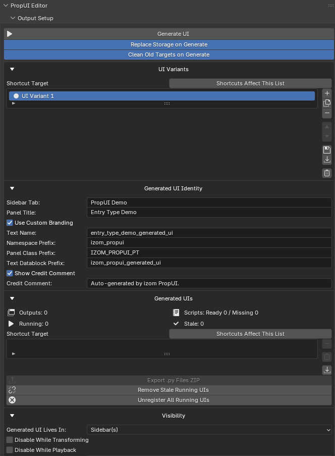
What PropUI does
PropUI turns custom properties into proper Blender UI. You author a list of
controls in a visual editor, arrange them into a layout, and press
Generate UI. PropUI writes a normal Python panel — stored inside your
.blend as a Text datablock or exported as a portable .py file — that keeps
running even when the editor is closed.
The generated panel is an ordinary Blender Panel. It can live in a sidebar tab or a Properties editor tab, drive custom properties on almost any data owner, and show or hide itself based on what is selected.
Full vs Free at a glance
| Free | Full | |
|---|---|---|
| Author & generate workflow | ✅ | ✅ |
| Entry types | Float, Integer, Boolean, Array, Text | All 11, incl. Data-Block & Python |
| Generated panel location | 3D Viewport sidebar | Any sidebar + Properties tabs |
| Shared rows | Up to 3 per row | Unlimited + column weights |
| Sub-panels & row boxes | — | ✅ |
| Conditions | Child Visibility | Visibility + Availability |
| Dynamic labels | Value-driven | Value, other-entry, Dynamic Text |
| Property storage | Object only | 38 target types + per-entry overrides |
| UI variants & shortcuts | — | ✅ |
| Custom branding | — | ✅ |
| Import / export & presets | — | ✅ |
Compare the editions in detail
See a real example
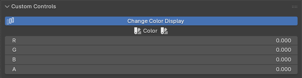
Follow the step-by-step build of this panel in the color display toggle example.
Where to start
-
New here?
Understand what PropUI is for and build your first panel.
-
Core concepts
The two-layer model: the Entry List you author and the Generated Layout.
-
How-to manual
Task-focused pages for each part of the editor.
-
Reference
Option tables, storage targets, shortcuts, limits, FAQ.